Olympic Symbol
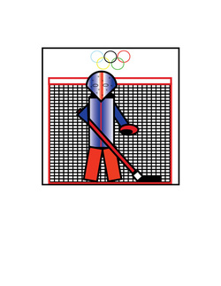
Objective: The graphic in this project can only be used with geometric shapes. When you look at the graphic you should be able to know what even the symbol is portraying.
Directions:
Dislikes: I did not like how how we were limited to using only geometric shapes
Likes: I liked how we could make the project colorful and how we used Adobe Illustrator
Directions:
- Create 4 thumbnails
- Choose one of your best thumbnails and complete the final using black in and drafting tools
- Align your project to the required measurements
Dislikes: I did not like how how we were limited to using only geometric shapes
Likes: I liked how we could make the project colorful and how we used Adobe Illustrator
Monogram
Objective: Use a vector illustration program create something personal about you. There should be a letter from your initials in your graphic.
Directions:
Dislikes: I did not like using the vector illustration program
Likes: I liked that we had to incorporate a letter from our initial into the project
Directions:
- Create 4 thumbnails
- Pick your best thumbnail and detail it and complete final image with the vector illustration program
- Align your project to the required measurements
Dislikes: I did not like using the vector illustration program
Likes: I liked that we had to incorporate a letter from our initial into the project
Maze
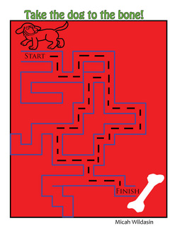
Objectives: Create a maze that a child 4-7 could solve. And to use images that are appealing to a 4-7 year old
Directions:
Dislikes: I did not like how we had to make the mazes simple.
Likes: I like how we had to incorporate pictures in the maze that were related
Directions:
- Make thumbnails
- Use a grid on Adobe Illustrator to help make the maze
- Print 2 copies- one with the path highlighted and one with out the path
Dislikes: I did not like how we had to make the mazes simple.
Likes: I like how we had to incorporate pictures in the maze that were related
|
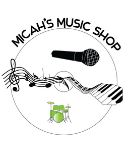
Objectives: Make a logo for your imaginary buisness. It should stand out and people should reconzie the logo specificly to your buisness
Directions:
Dislikes: I did not like how the drums are the only thing colored in my project Likes: I liked the purpose of how we made imaginary businesses |
Logo
 |
 |
Objective:
|
Objectives: Take a picture of you doing something that expresses yourself
|
 |
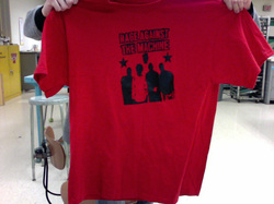 |
Objectives: Make a t-shirt with any graphic you choose
|
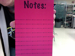
Objectives: Make a design for a note pad
|
 |
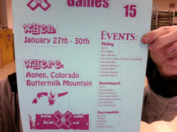 |
Objectives: Pick an event and advertise when and where
|
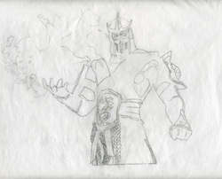
2 Line Design
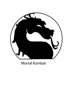
Objective: Only use 2 continuous lines to form a graphic. It should emphasize the Gestalt principle of "Closure."
Directions: Should only contain 2 continuous lines. It should have no more than 2 lines of text. The graphic must contain only 3 colors. And int must be 6"x9"
Dislikes: I did not like looking for a specific font for this graphic.
Likes: I like my dragon. It looks a lot like the symbol for Mortal Kombat
Compass Cover
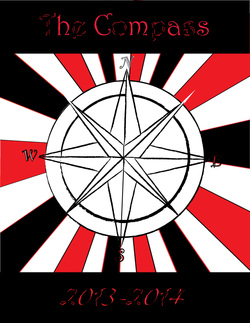
Objective: A little class competition to see who designed next year's best looking Compass.
Direction: The compass is 81/2" x 11". The cover needs be completed in portrait. The title needs to be clear and understandable.
Dislikes: My title has a cool font but it may be hard to read from a distance.
Likes: I liked how i used school colors and designs.
Direction: The compass is 81/2" x 11". The cover needs be completed in portrait. The title needs to be clear and understandable.
Dislikes: My title has a cool font but it may be hard to read from a distance.
Likes: I liked how i used school colors and designs.
History Poster
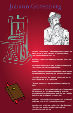
Objective: To research a variety of topics and make an informing poster about your topic. My topic was on Johann Gutenberg.
Direction: The final size is 11 x 17. There must be 6 graphics. It also must have an easy to read title.
Dislikes: I didn't like how there were a limited supply of topics to choose from.
Likes: I liked how my printing press came out.
Direction: The final size is 11 x 17. There must be 6 graphics. It also must have an easy to read title.
Dislikes: I didn't like how there were a limited supply of topics to choose from.
Likes: I liked how my printing press came out.
Book Jacket
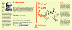
Objective: Design a book jacket for your favorite book. My favorite book I used was Horton Hears A Who!
Direction: You must fully complete a front cover, spine, back cover, front inside flap, and back inside flap
Dislikes: I should of consistently used the same font style.
Likes: I liked how my Horton came out.
Direction: You must fully complete a front cover, spine, back cover, front inside flap, and back inside flap
Dislikes: I should of consistently used the same font style.
Likes: I liked how my Horton came out.
Athletic Schedule
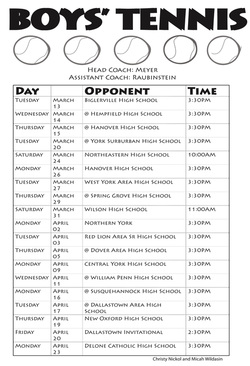
Objective: Make a real schedule of a spring sport for the season.
Direction: You need to include a big title, coach's name, day, month, date etc
Dislikes: I didn't like how the tennis balls were lopsided.
Likes: I like how my title is phased.
Direction: You need to include a big title, coach's name, day, month, date etc
Dislikes: I didn't like how the tennis balls were lopsided.
Likes: I like how my title is phased.
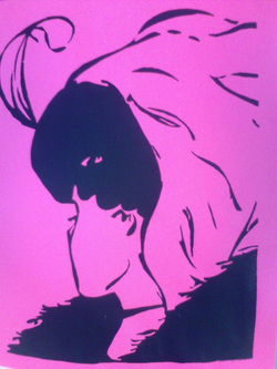
Colorization
Objective: Pick a graphic and learn how to use photoshop with blending colors and learning the new software.
Direction: Try to trace and imitate your original graphic as close as possible.
Likes: I like the Mortal Kombat theme I stuck with.
Dislikes: This was the one project I ran out of time trying to do.
Direction: Try to trace and imitate your original graphic as close as possible.
Likes: I like the Mortal Kombat theme I stuck with.
Dislikes: This was the one project I ran out of time trying to do.
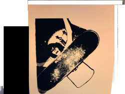
Screen Print Posterization
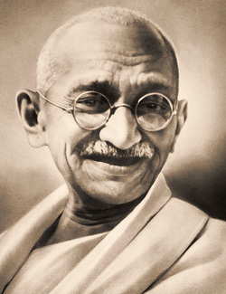
Objective: You pick 3 colors and lay them on top of each other and print on a T-Shirt.
Direction: Pick 3 colors and 3 different screens to be aligned and printed on T-Shirts.
Likes: I liked our color choices (Black, Gray, and Blue) and the image choice of Gandi.
Dislikes: Andrew and I took to long on the Colorization project and ran out of time so we could not print straight on some of the T-Shirts
